The Bioclimatic Design. by Fahad Malik

“We are facing an ecological emergency. According to the United Nations, if we want to avoid a climate breakdown, carbon emissions must be cut by 45% by 2030 and reach zero by 2050. We are no longer discussing an environmental catastrophe that might impact future generations, but a catastrophe that will now drastically affect our own”

Eco-Visonaries Exhibition, Royal Academy

I think it is possible to talk about an approach to sustainability in extremely simple terms. For example, it’s cold and you have some wood, you can burn the wood and you will feel warmer. On the other hand, you may use the wood to construct shelter to provide warmth (Banham’s parable). My interest toward Environmental Architecture is concerned with maximising the potential of the latter. Such thinking translates to practice, where I am keen to remind client’s that the most sustainable approach is to reduce the energy demands of the proposal from the outset.

Using daylight is a key consideration with regard to visual comfort, as well as thermal comfort. Understanding how light from the sun impacts the proposal and how to manipulate daylight internally are important design considerations. I’m interested in looking at annual daylighting in foot candles, spatial daylight autonomy (sDA) & daylight factor analysis, to work in conjunction with the design concept. In the next post I will break down how detailed analysis of these factors can help influence the design concept at the outset.

The driving force behind this approach is rooted in the idea that changes in the physical environment can affect the behavioural patterns of people. The examination of a series of multi-faceted subjects facilitates design quality as well as environmental responsibility. Believing that such practice is possible is a source of inspiration, even when it diverges from the conventional path.

Eco-Visionaries: Confronting a planet in a state of emergency, Royal Academy of Arts, London, 23 November 2019 — 23 February 2020

Eco-Visionaries: Confronting a planet in a state of emergency, Royal Academy of Arts, London, 23 November 2019 — 23 February 2020

The Concrete Pavilion. by Fahad Malik

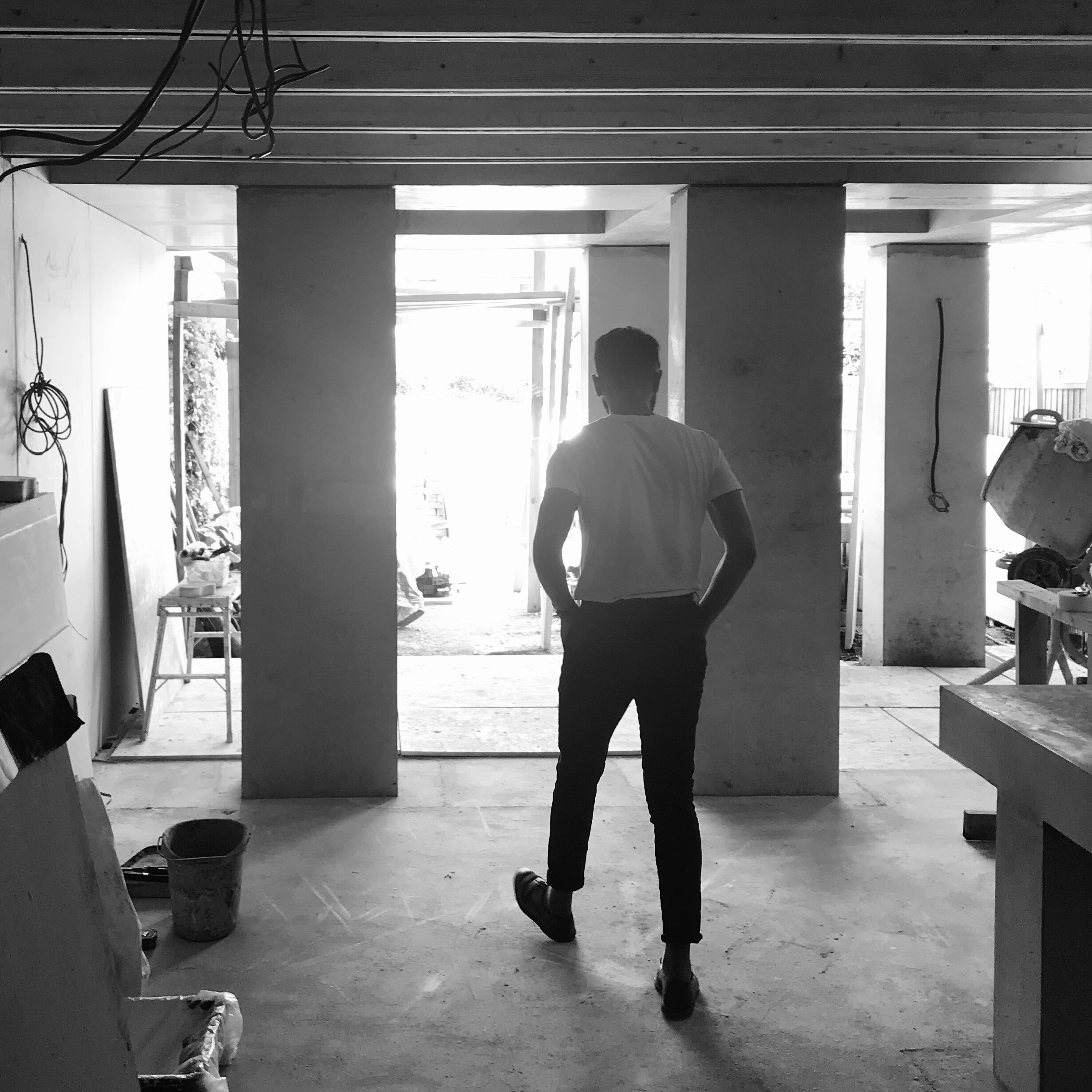
Next week, I will be issuing practical completion on the first project I have finished with in-situ concrete. There have been lessons over the design, detailing and construction stages of the project, but I want to cover the key technical issues related to in-situ concrete.

Sample

I asked the contractor to pour our concrete mix into a 600x600x600 mould. This meant we could judge the corner conditions, surface finish and formwork joints and adjust our strategy accordingly. The cement was 40% OPC and 60% GGBS with a water cement ratio of 0.5 and cement to aggregate ratio of 1:6. We used 18mm thick MDO film faced ply for formwork and applied two coats of release agent and still used a layer of mesh in the sample. We removed the formwork after 48 hours, but the sample was still drying, it took three further days for the colour to stabilise. The colour with the mix set out above was like a light marble, with a smooth glossy finish, like poured stone. The common method is to silicone the joints between the formwork sheets, however upon testing the contractor realised that the joints are much neater if we use wood filler as opposed to silicone and butt the sheets together as closely as possible.

Reinforcement

Sometimes the main contractor can take over this element, but it is important to ask the structural engineer to price for a full set of reinforcement drawings with rebar schedules. Our contractor needed guidance here and we had to ask the engineer to prioritise this while works had started on site. The kitchen island in the project is also in-situ concrete with dramatic cantilevers, which required careful setting out- concrete is great in compression but terrible in tension hence the requirement for steel rebar.

Formwork

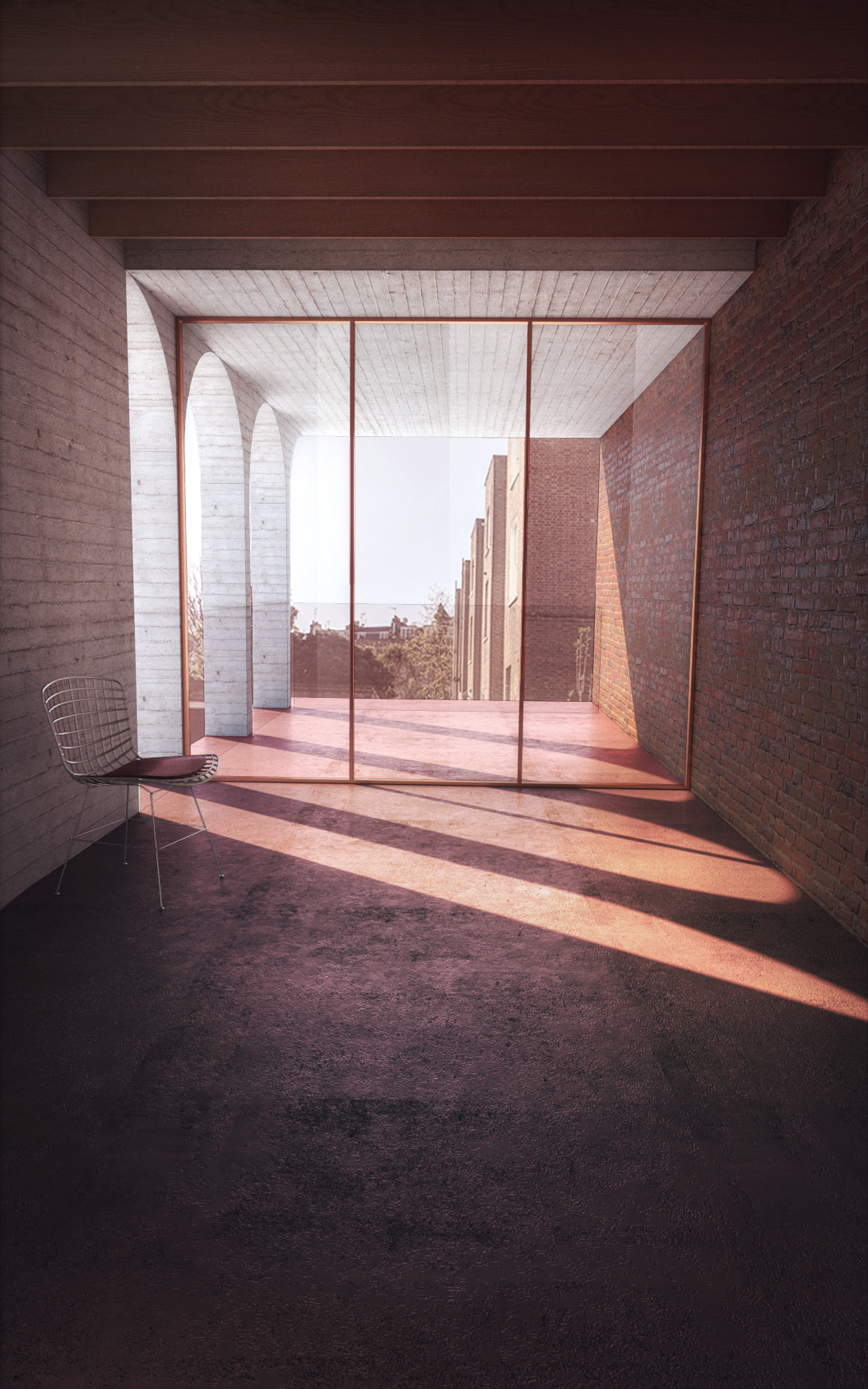
Once the formwork material is finalised, detailed drawings are required setting out the formwork sheets. No matter how neatly you fill between sheets, it is inevitable that joints will be visible considering the pressure of the concrete once poured. I set the sheets out based on the rhythm of the elevation/columns and lining through with the rooflight upstands in the exposed concrete soffit. Consequently, even where the joints are a bit raw, it looks intentional as they line through with a column, window or rooflight opening. One must watch that the film face isn’t wrinkled, or edges curled while checking all fixings before concrete is poured. The formwork requires two coats of release agent throughout, I specified Nufins Chemlease watching that excess was wiped away after two coats. This process needs to be super neat, waiting for the first coat to dry before applying the second, otherwise there is risk of surface retardation on the concrete face.

Temporary Works

The contractor took this on and used their experience. At one point you could barely walk through with the amount of acrows holding up the concrete ceiling. Additionally, an extensive timber structure had to be built, just to support the formwork and retain the pressure of the concrete once poured. However, we didn’t use clamps and in certain places the concrete slightly bowed, perhaps only visible to the architect. Ideally, a detailed temporary works design should have been undertaken before works began but this is driven by the scale and budget of the project too.  
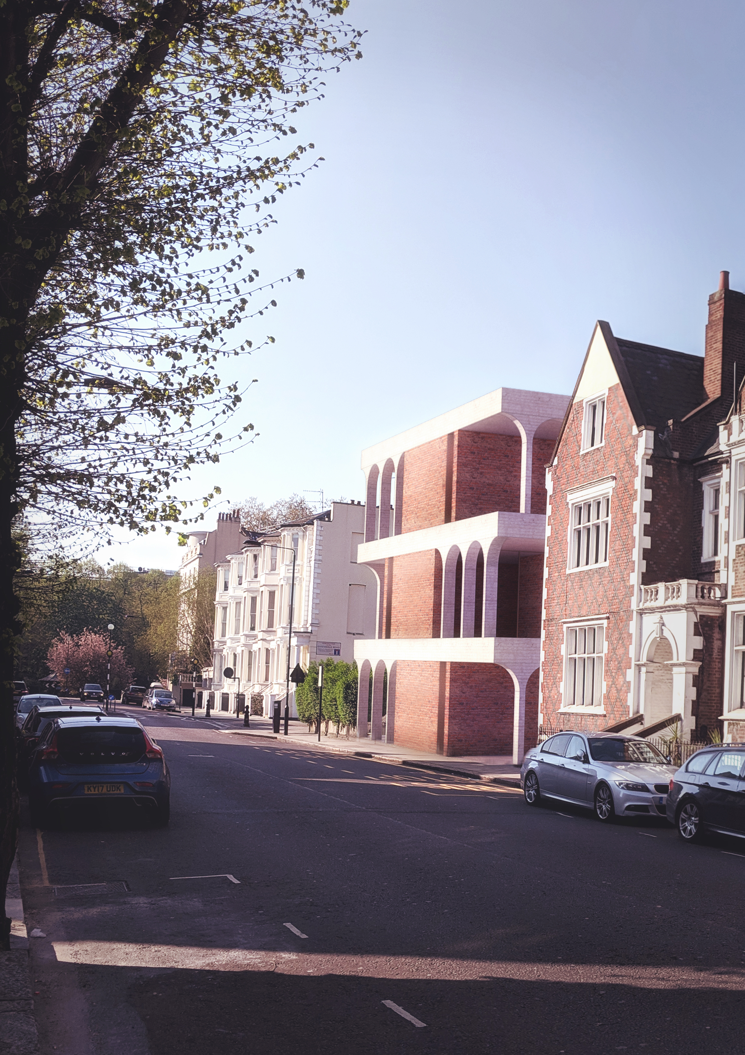
Shadow Gaps

I had to contend with two party wall conditions, so packing out the formwork and creating shadow gaps against these junctions was successful in elevation. However, I also had shadow gaps at the column to soffit intersection, which were created by using a glazing bead. This was too fussy for the material in retrospect, as they took off the formwork, they had to chisel the gaps out and it was difficult to execute clean lines. Shadow gaps in concrete should only be used where critical and the dimensional tolerance should be bumped up to 20mm to achieve clean edges.

Thermal Breaks

An exposed concrete soffit at 200mm thickness, obviously results in a significant cold bridge at the window head in this case. The engineer and I got around this by using ancon thermal breaks which are used on large projects between the floor structure and external balconies. These had to be welded to the rebar and set out carefully so the depth of the window frame would conceal them in the soffit. The lead times on these can be significant and this held us up from pouring for a while, so my advice would be to factor this in very early.

Sequencing

We poured the columns, commenced vibration, then poured the ceiling & upstands in one hit. In retrospect this could have been broken down further. The upstands were high to take the roof build-up and the concrete was just falling into the soffit formwork as they tried to pour these. It would have been a lot easier if we had waited for the ceiling to dry, set out a joint forming a drip in the soffit and then poured the upstands at parapet and rooflights.

Compaction

Once the concrete is poured, 30mm electrical pokers are inserted to vibrate the concrete and fill the mould. It’s important to not have there too close to the formwork, as this can result in poker burns and colour variations. They are usually inserted for 20 seconds- it’s important to withdraw the poker heads really slowly to remove all trapped air, removing too quickly can result in large blow holes trapped on the form face.

Sealing

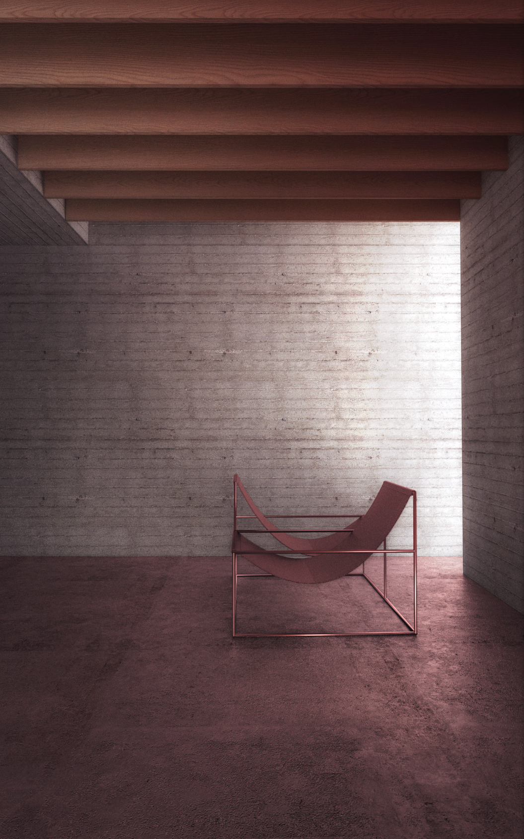
This is the very last step, at the end of the project after the concrete has fully dried. The colour of the concrete actually continued to change quite significantly over a few weeks. Two coats of sealer should be applied to all internal and external exposed concrete surfaces. I specified Facael Oleo by Ethical coatings to provide a water repellent, vapour permeable seal to the surface. Additionally, the detail at the parapet used liquid applied waterproofing (Triflex Prodetal), hence no flashings are visible in elevation, providing concrete edge at the top of the building.

Overall, I think I understand the nature of the material much more than I did before. My instinct architecturally was to tightly control every aspect of the work, thinking this would result in an aesthetically pleasing and refined finish. However, with in-situ concrete the elements that you try to “design” are also the areas that will backfire on you tremendously. The most enjoyable parts of the finish are actually the areas that are a little flawed- the small blow holes, an expressed formwork joint, subtle variations in colour and aggregate and disparities in quality of reflected light.

Site Inspection/ August 27th, 2019

Site Inspection/ August 27th, 2019

The Hierarchy of Buildings. by Fahad Malik

London has a great building culture due to high land value. Clients are prepared to invest heavily, even on modest projects, creating a fertile environment of experimentation for young architects who position themselves thoughtfully. Conversely, most architects working on small to medium scale projects are primarily focused on residential, refurbishment and extension work. I have often noticed this resulting in a curiously amusing hierarchy of buildings; curious because the power of building is far greater than what can be illustrated in a kitchen design, and amusing because it’s obviously infantile to make interior joinery the ‘drop-mic’ moment of your project. These elements can only be meaningful if they reference the overall concept, they cannot be your starting point. Often, designers are more opinionated about joinery and kitchens than the building envelope details themselves. Most of these residential extensions across London are guaranteed to boast exceptional kitchen designs and tragically un-elegant exterior elevations, concurrently. The solution is for architects to clarify a personal hierarchy for the building before the design process begins. I have found the following is useful:

  1. Proportions: Preference to keep dimensions proportional, ordered and elegant.

  2. Structure: A thoughtful way of expressing the structural elements of the building, related to its proportions.

  3. Daylight: Thinking about direct and diffused lighting and its effect on the proportions and structure.

  4. Narrative: Carefully designing the differences between from one room to another, so varying atmospheres can be felt powerfully.

  5. Repetition: The more you repeat an idea, element or proportion in a building, the better it gets.

  6. Contradiction: At the heart of all great art, there are always two ideas that are the same yet entirely contradictory. 

  7. Juxtaposition: The detailing of the building, looking at corners and junctions between different elements.

  8. Materials: Technical exercise of exploring potential of the chosen material in terms of density, texture colour etc.

In Britain, there is a tendency for architects to fetishise materials, textures and colours. However, in my limited experience, I have found it increasingly difficult to polish a turd with nicely detailed materials. I think these are the weaker elements in architecture, if I can execute the primary volumes with a degree of poetry, the colour of the bathroom tiles will be irrelevant. 

No. 428 2013 by Rana Begum

No. 428 2013 by Rana Begum

The Purpose of Writing. by Fahad Malik

I am conscious of my writing being perceived as a self-indulgent, condescending whine due to a continued antagonistic relationship with conventional architectural practice. Writing helps vent frustrations and rationalise ideas, like that cliché of writing to discover what you think, in a way that social media cannot. Social media is image focused and constructed with an audience in mind yet writing in a different format can be for yourself, a targeted audience or no one whatsoever. Additionally, I am drawn to the immediacy with which I can construct ideas through writing, something which can take years in architecture.

I recently read an interview with the French painter Fabienne Verdier, who learnt calligraphy from the old masters in China. They would make her practice drawing one line for weeks on end, with the ambition that each stroke should represent the energy of your perception. If the energy is accurate, there can be no mistakes because there are no corrections. This is what writing feels like. Verdier says that the act of painting can be done in a matter of minutes, but each piece represents months of planning. This is what design feels like.

Deconstructed Sign by Fabienne Verdier

Deconstructed Sign by Fabienne Verdier

The Millennial Villa. by Fahad Malik

I recently entered a competition inviting architects to rethink the suburban home for the 21st century. I chose a site to provocatively highlight the disparity between the typology of a suburban villa and requirements for contemporary urban living. To purchase a large suburban home in London with multiple bedrooms is not an economic reality for my generation. As opposed to suburbia spanning away from the city centre, perhaps it is worth exploring what lessons can be learnt from this model, to generate an architecture rooted within an urban context. Consequently, the starting point for the design proposal is to ask a question; can the typology of an affluent suburban villa be developed for contemporary urban living?  

The site is at the corner of St Ann’s villas and Queensdale road in West London, a residential street developed in the mid-nineteenth century as part of the Norland Estate. The properties are semi-detached, largely converted into flats with red brick facades and slate roofs, built in a mock Tudor style. There are many similar examples of  traditional suburban villas in London against an increasingly urban context, considering the growth of the city over time.  

The design proposal is idealistic, giving equal importance to outdoor rooms and internal floor area. Proposed as a series of mirrored elements, a matrix between interiors and verandas is created on each floor, allowing spaces for dining, living, studying and sleeping to flow from one to the other. Each room mirrors the proportions of another, every gesture is reflected elsewhere with semi-circular arches, corner windows and views across brick walls to achieve a coalescence of interior and exterior. It is not possible to change a singular element without affecting the whole.  

The ground floor has multiple entrances as a shared living space, with eight self-contained units and private terraces on the upper floors. While the design may be adapted to family and generational living, it looks to take the typology of a suburban villa and modernise it for a younger generation. It manifests as an idea for a home, but also one for society, questioning our presuppositions toward living, interaction and community. 

The Machine for Living. by Fahad Malik

Much of my earlier learning in practice was concerned with economy, the challenge of achieving an architecturally thoughtful result with a modest budget and reinterpretation of common forms and materials. Conversely, it was great to see a Scottish project win the RIBA house of the year, my only fear being that it will solidify the perception that only archetypal forms are possible in this part of the world. I suppose what I learnt in addition, was to question myself and the preconceptions of others about what architecture should be, what buildings should look like, what materials should be used, how big a bedroom needs to be and so on. I envy the architect that can be selective upon the same form, make the interior all white and re-apply the detail that’s been tried and tested.

It is only recently, that I have had the opportunity to design bespoke furniture to coalesce with the wider ambition of the project. Subsequently I find myself questioning preconceptions once again- why can’t a bedroom be less than nine square metres? Why do we need a wardrobe? Technology has changed the way we live forever, and physical space has been replaced by digital space. One terabyte of my cloud storage is far more valuable than a square metre in my flat. The architect’s challenge is to create meaning for the remaining physical space in the most ferocious manner, a new machine for living which surely does not manifest as a pitched roof, timber clad house in the countryside.

Abitacolo Bed 1972 by Bruno Munari

Abitacolo Bed 1972 by Bruno Munari

The Anodyne Architecture. by Fahad Malik

I recently attended an extensive exhibition on the work of Tadao Ando at the Centre Pompidu in Paris. I felt, much of this work is archetypal of what my education was trying to nudge me toward, a restrained, monastic aesthetic concerned deeply with materiality, light and the senses- principles that I continue to be interested in. As an architecture student you are shown diffused light falling on a concrete wall and told it is beautiful. However, as I get older, I wonder if architecture can be more than just exposed concrete and birch-faced plywood.  

 On the other hand, proposing new wacky shapes facilitated by innovations in software is also problematic. Use of multiple colours and different shapes in some form of arbitrary post-modern revival can be equally disorientating. It doesn’t take much skill to use colours or create a new shape, or a baby with a crayon could issue multiple concept designs within a minute. I do not believe architecture can be instinctive, or come from the gut, the design process should be controlled, calibrated and precise.

 If I had to make one criticism of my generation of architects, it would be that perhaps they are more influenced by precedents than conceptual ideas. I wonder if Instagram, Pinterest or Dezeen may have more influence on today’s designers as opposed to a personal, reflected ethos toward architecture. In such an age, architecture can only be regurgitation of the current style. Given the current trend of sensitive, restrained brutalist revival, I worry if we will be remembered as propagators of the anodyne architecture.

Kompozycja przestrzenna 4, 1929 by Katarzyna Kobro

Kompozycja przestrzenna 4, 1929 by Katarzyna Kobro